
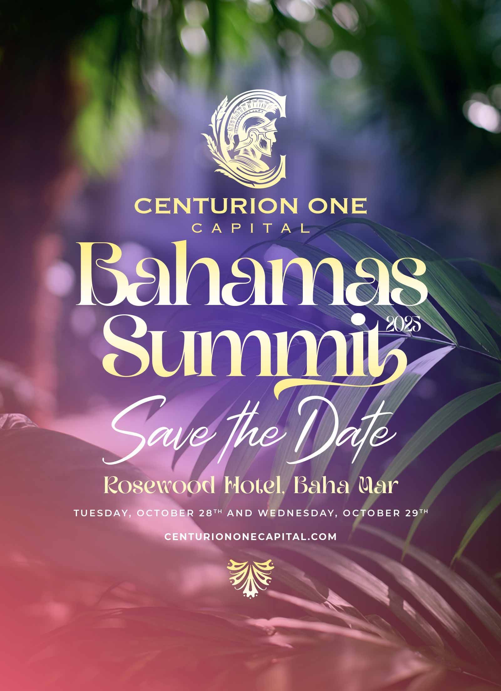
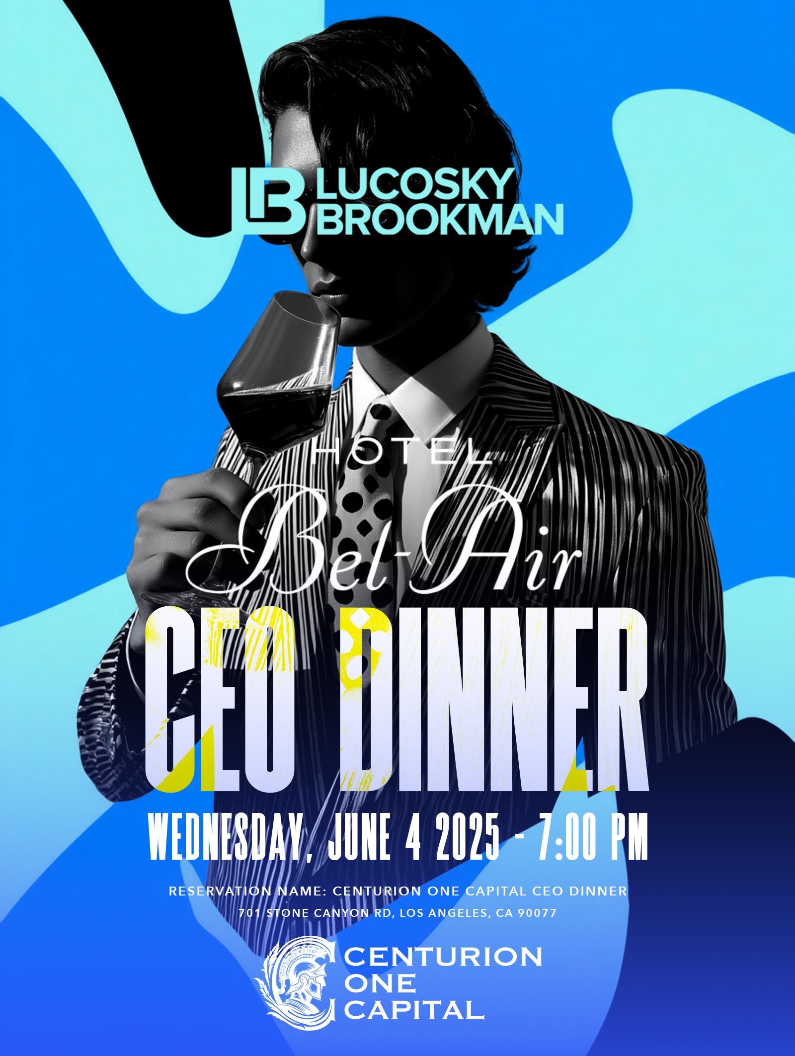
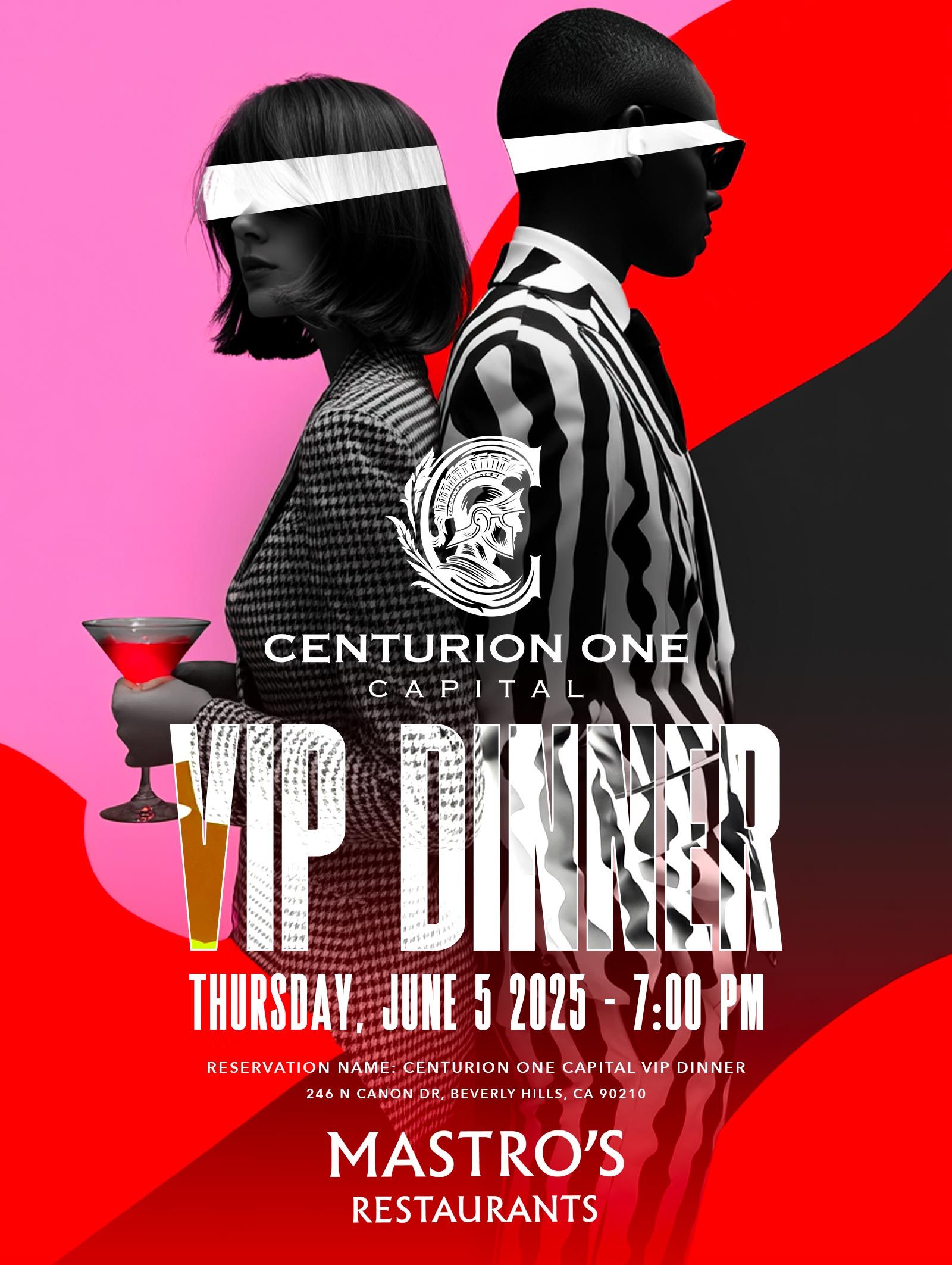
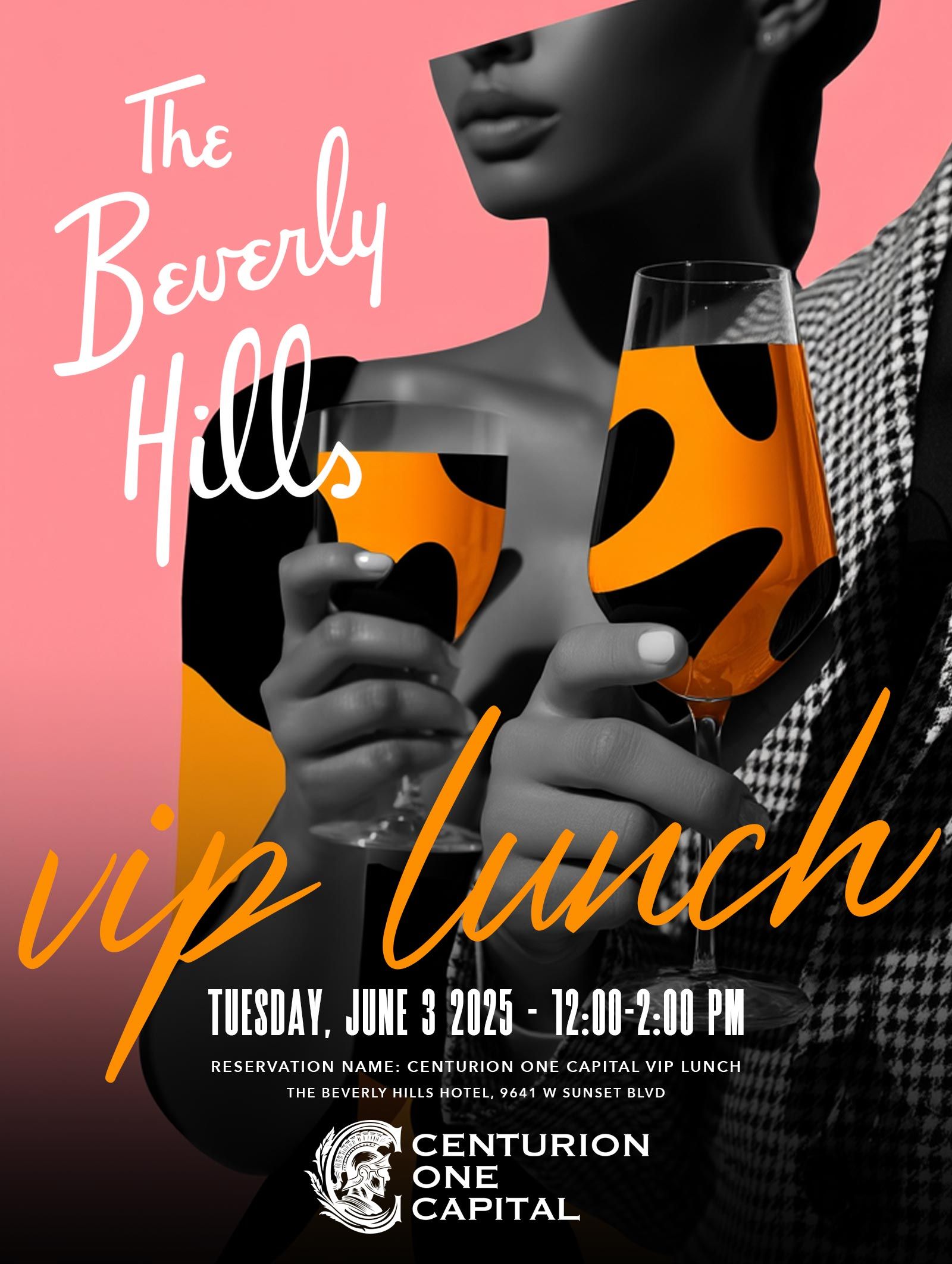
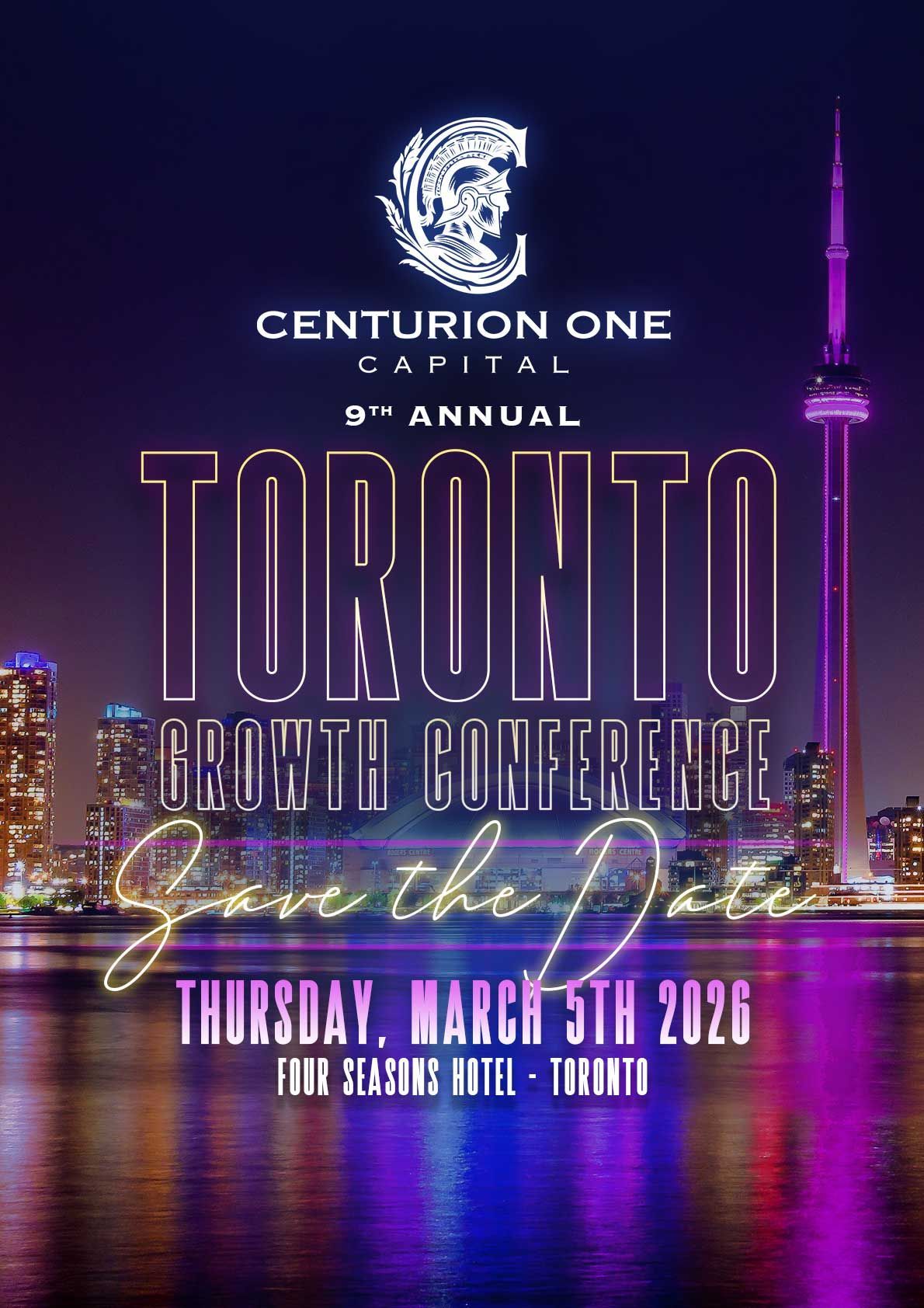
CENTURION ONE CAPITAL
For the past two years, I’ve been the sole creative partner behind Centurion One Capital’s visual identity, storytelling, and public presence. Together, we didn’t just refresh a brand, we redefined what modern investment banking can look and feel like.
This partnership has been about transformation at scale.
Centurion One Capital operates in one of the most conservative, visually stale industries imaginable.
The goal was never to “make it look nicer.”
The goal was to
flip the category upside down.
• Brand & Visual Direction
• Photography & Portraiture
• Cinematic Event Films & Recaps
• Marketing & Digital Assets
• Investor-Facing Visual Content
• Social & Campaign Creative
THE NEW LOOK


THE PREVIOUS DESIGN
The original logo of Centurion One Capital, while attempting to convey strength and luxury, falls short in several key design aspects, giving it an amateur disjointed appearance.
- Poor Symbol and Typography Integration: The golden centurion circle and stylized 'C' are disjointed and lack harmony, making the logo feel unfinished.
- Typography Issues: The font choice and sizing are disproportionate, resulting in an awkward composition. Centred text to left justified logo.
- Flat Color Scheme: The gold appears flat and lacks depth, failing to convey the intended luxury.
- Professionalism: The overall design lacks polish and cohesion.
RELATED PROJECTS