
MTL CANNABIS CORP.
It’s time for MTL Cannabis to look as powerful as it performs.
Presented to: Michael Perron - Chief Executive Officer
Prepared by: Nick Harborne Creative
Overall Design Direction
The goal of these design explorations is to position MTLC as a premium, future-forward parent company — taking inspiration from luxury brands like Rolex and Equinox, with a visual language that is elegant, modern, and minimal. Each concept leverages clean typography and refined cannabis-inspired icons, with a focus on subtlety rather than overt cannabis references.


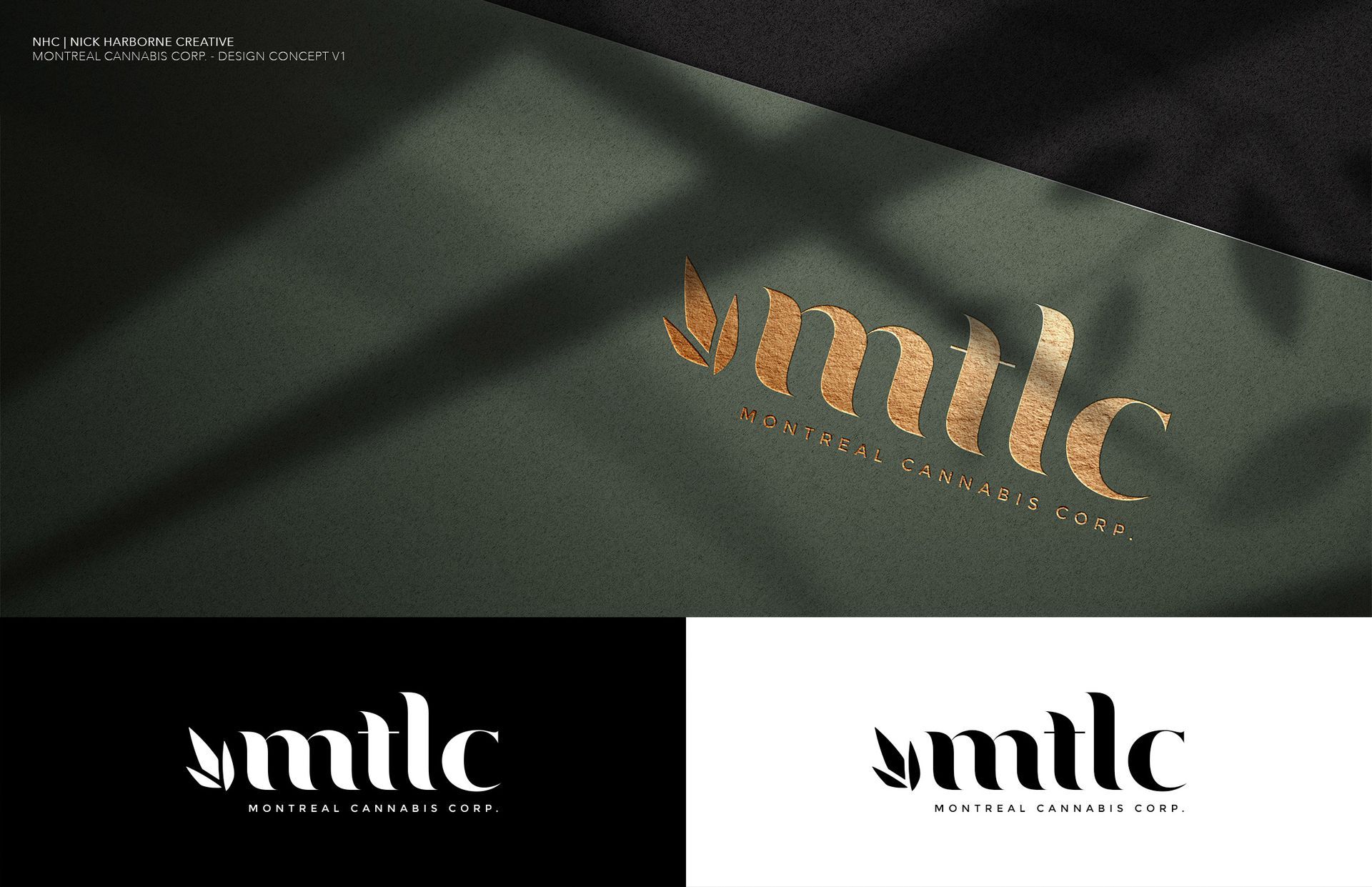
Concept V1
- Look: Classic elegance with a minimal geometric leaf to the left of "mtlc".
- Tone: Understated and corporate, leaning into editorial luxury.
- Strength: Very adaptable — strong for website headers, investor decks, and packaging.
- Visual Cue: The leaf is clean and abstract, immediately reading as premium.
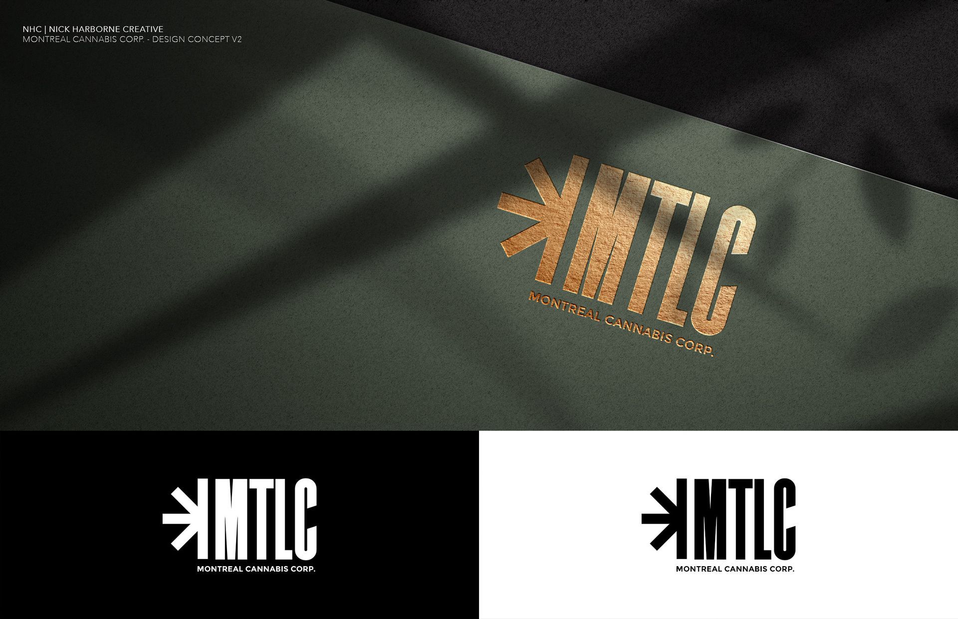
Concept V2
- Look: Vertical block typography with a bold modern sans-serif, paired with a sunburst/abstract leaf emblem.
- Tone: Confident and edgy — feels like an institutional seal or modern crown.
- Strength: Best for a modern holding company vibe. The icon stands on its own as a recognizable brand mark.
- Visual Cue: The radial starburst doubles as a subtle cannabis nod.
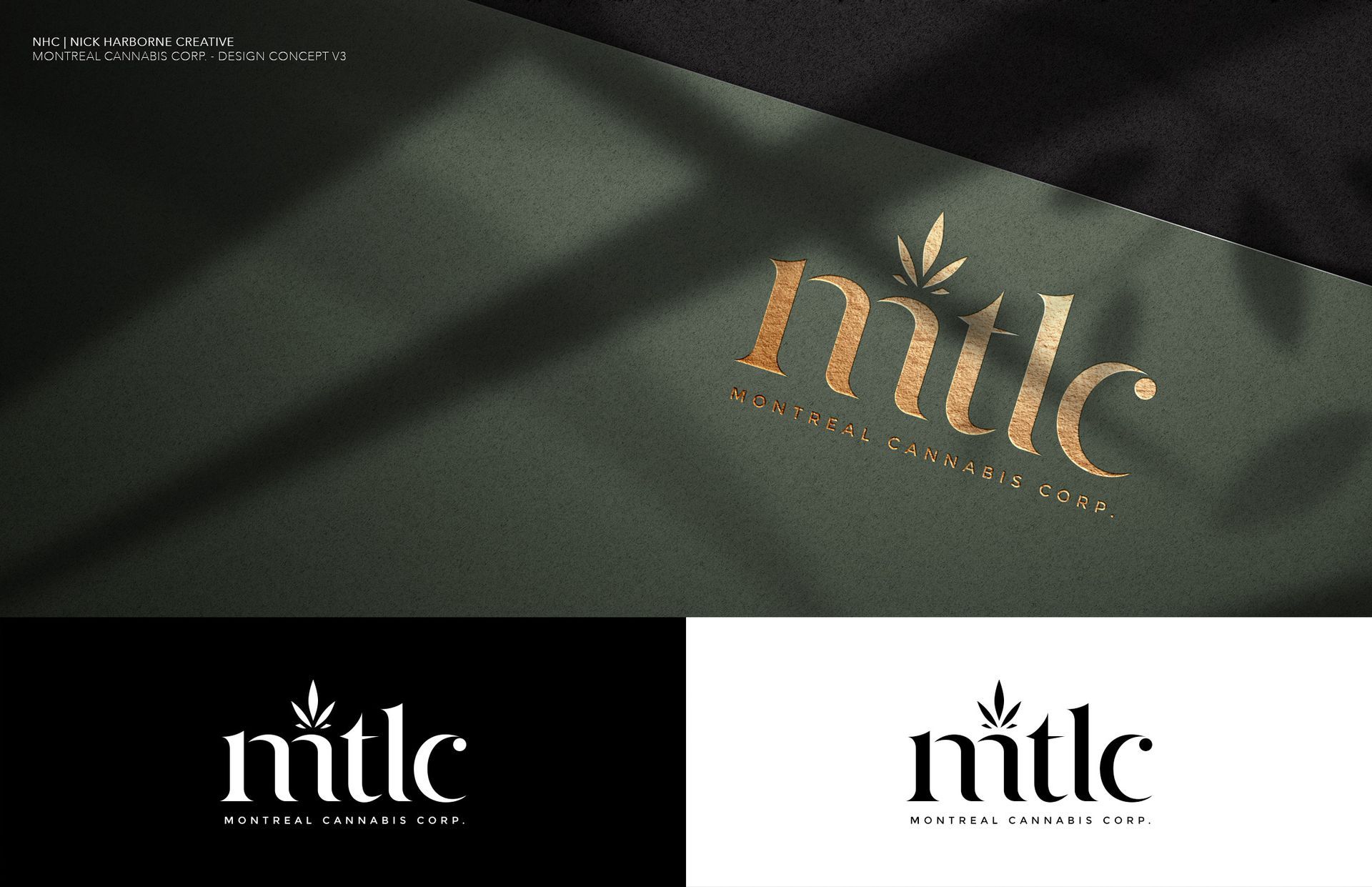
Concept V3
- Look: A fashion-inspired wordmark with sharp serif cuts and a refined leaf icon above the "m".
- Tone: Editorial and fashion-forward (think Vogue meets Louis Vuitton).
- Strength: Perfect for lifestyle or premium marketing materials.
- Visual Cue: The vertical leaf emphasizes upward growth, though can be removed or changed.
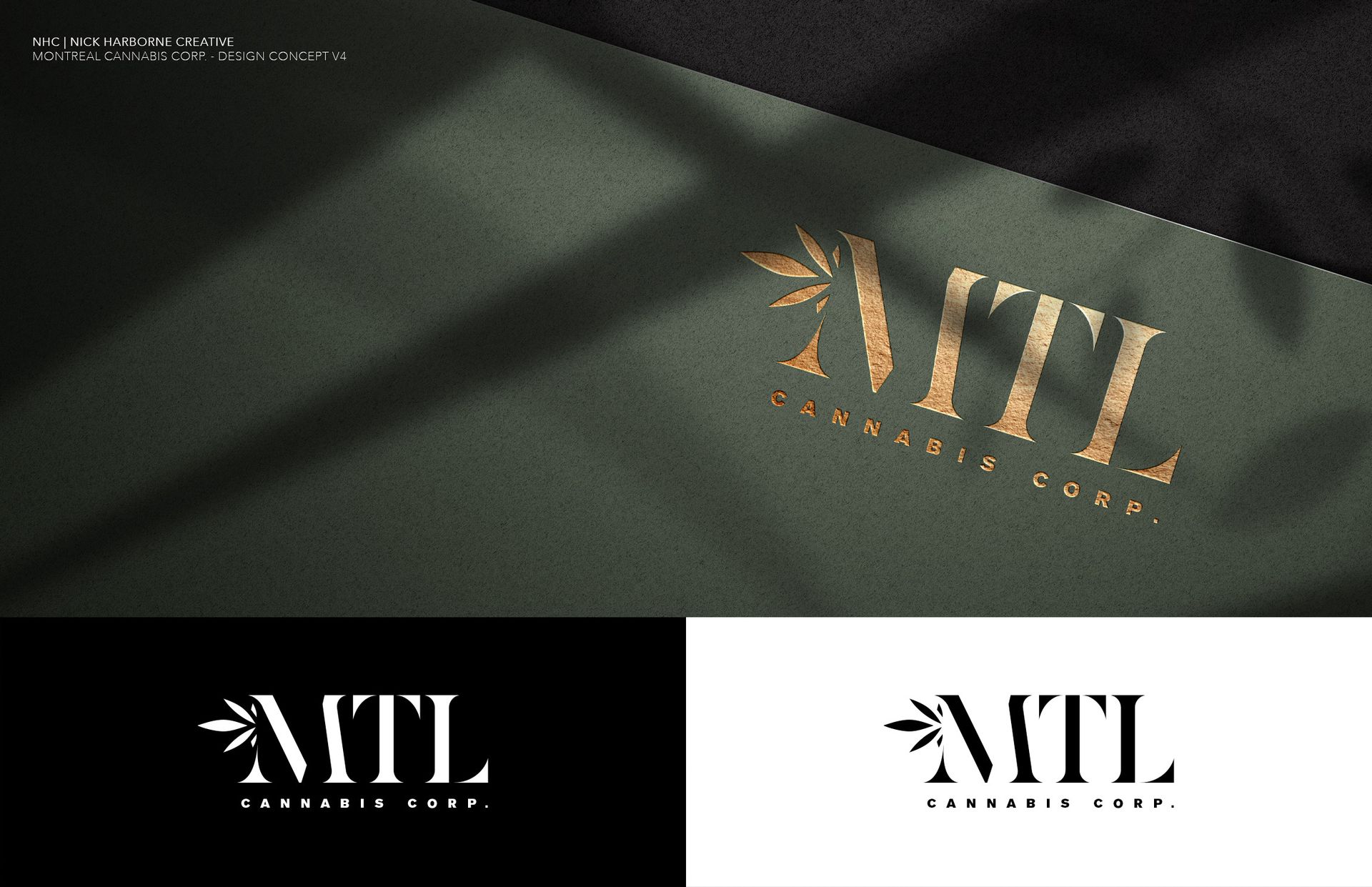
Concept V4
- Look: A classic serif "MTL" with clean uppercase letterforms and a leaf accent integrated into the M.
- Tone: Corporate yet luxurious — blends heritage with modernity.
- Strength: Timeless — works well for embossed treatments, gold foil, and executive branding.
- Visual Cue: The integration of the leaf within the M creates a subtle signature mark.
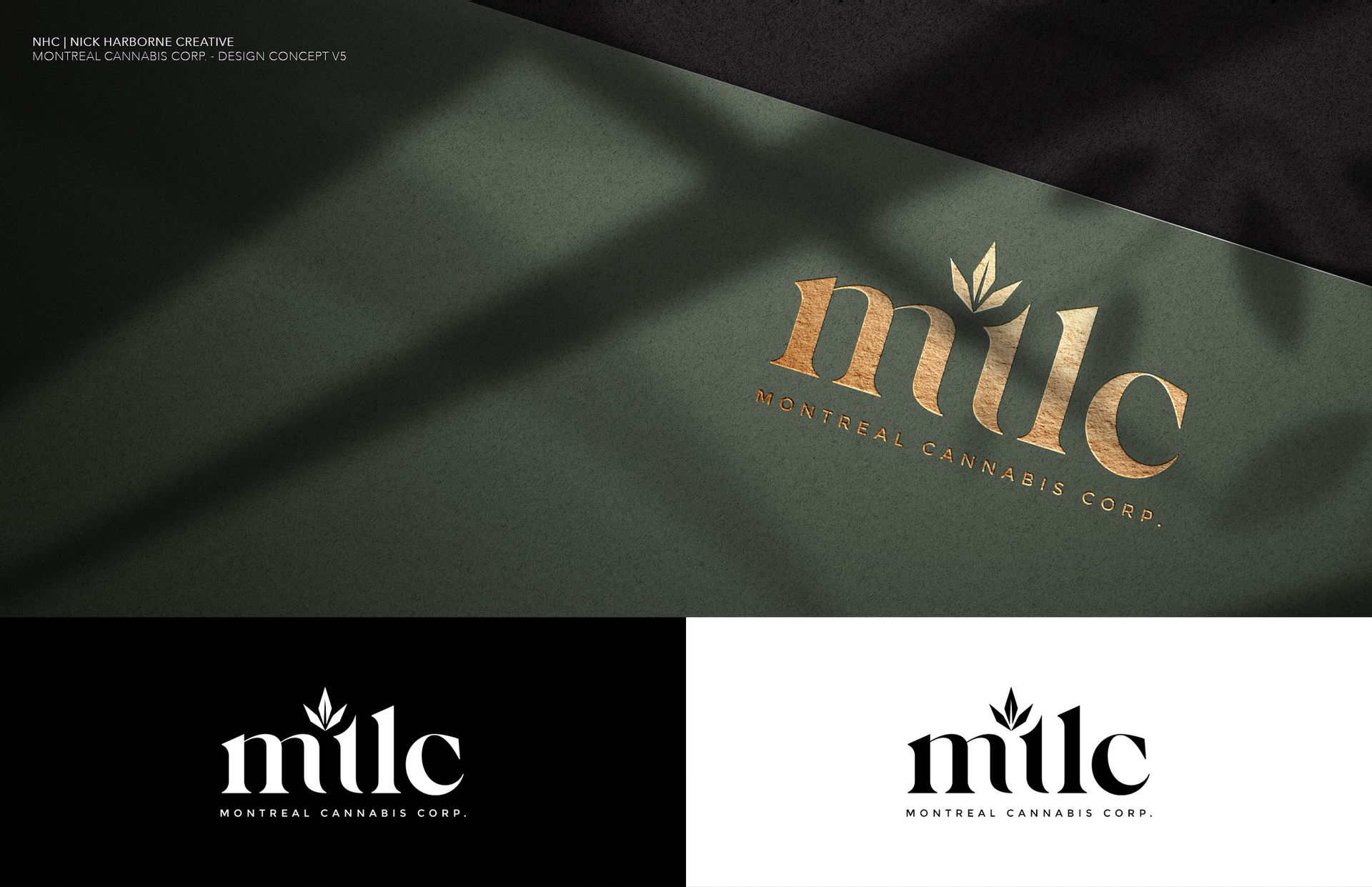
Concept V5
- Look: Smooth lowercase wordmark "mtlc" with a crown-like leaf, playing into a Rolex style vibe.
- Tone: Minimal and approachable yet refined.
- Strength: Has a tech-luxury feel and could be the most versatile across print, web, and digital.
- Visual Cue: The small leaf acts like a brand diacritic — subtle but memorable.
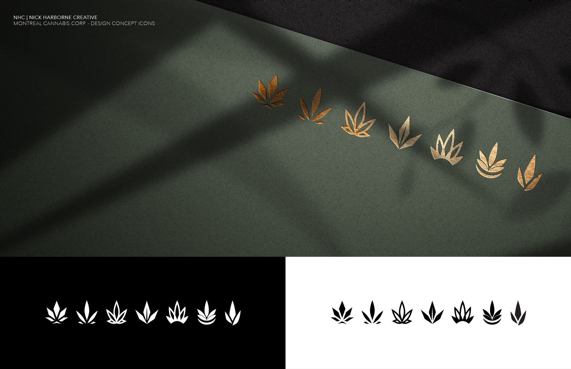
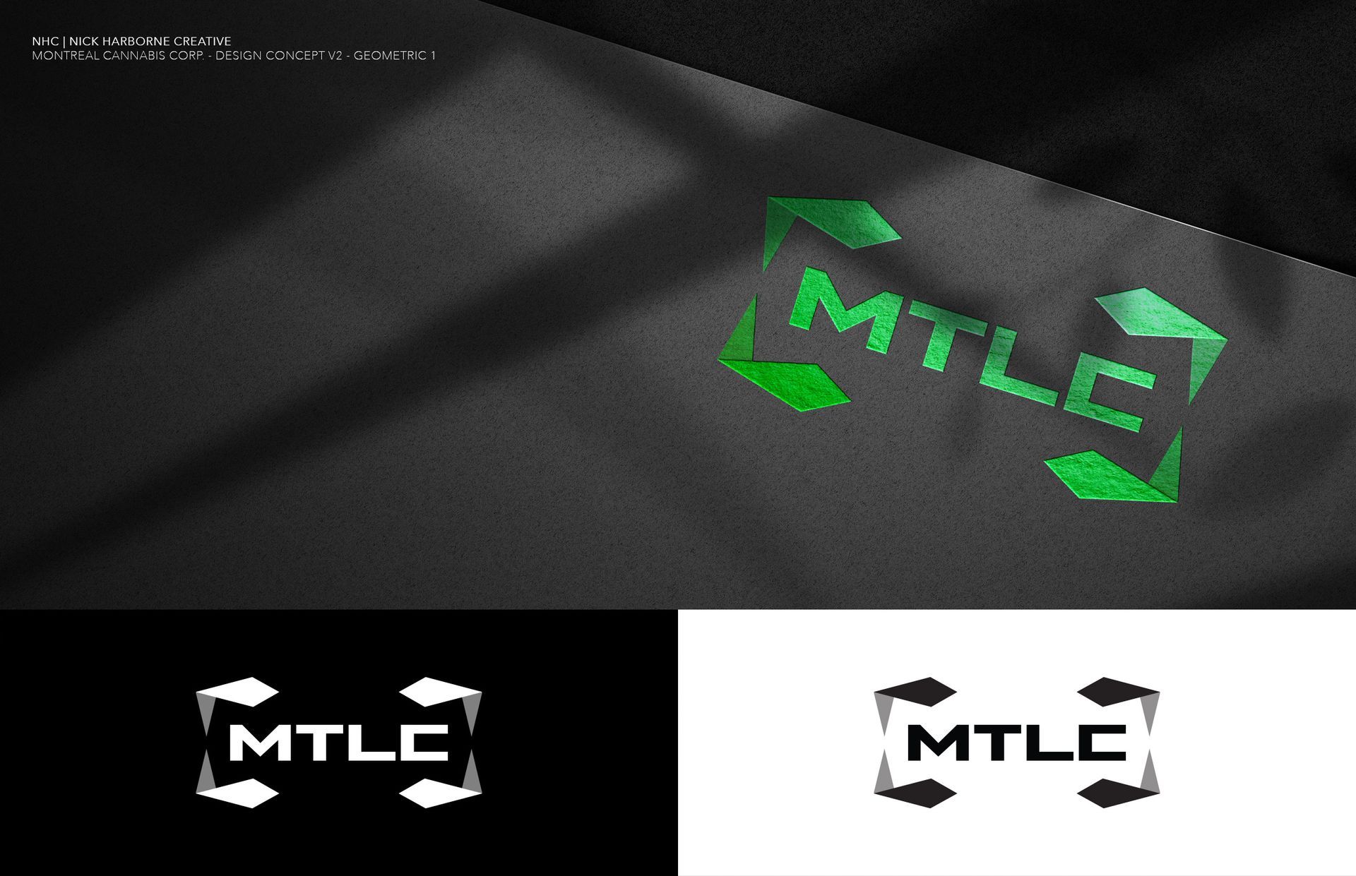
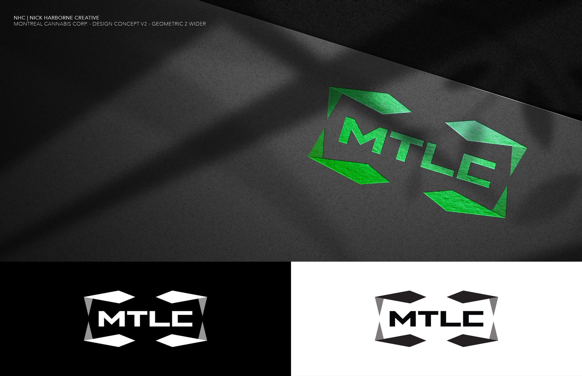
Icon Exploration (V6)
- Look: A series of abstract cannabis-inspired leaf icons — exploring geometry, minimalism, and symmetry.
- Tone: These can function as standalone brand elements for sub-brands, product marks, or background patterns.
- Strength: Highly flexible — each icon conveys cannabis without being cliché.
- Visual Cue: Designed for high adaptability (e.g., foil stamping, app icons, social media).
$26M
quarterly revenue
54%
GROSS MARGINS
TOP 10
IN NATIONAL FLOWER & PRE-ROLL
Overview, Goals & Objectives
MTL Cannabis is poised to set a new standard for what a modern Canadian craft cannabis brand can be — confident, premium, and unmistakably authentic. The goal of this engagement is to transform MTL’s entire corporate identity into an elevated, cohesive brand experience that matches its industry-leading performance. By partnering with me, MTL will rebuild its logo, visual system, investor materials, and corporate website with the same polish and precision you see in world-class lifestyle brands like Equinox, ASRV, or Porsche — but with a distinctly Canadian edge. The objective is simple: create a powerful, scalable brand that attracts investors, unites your portfolio of products under one clear story, and positions MTL as the leader in premium craft cannabis at home and abroad.
All guided by a dedicated creative partner who will protect and evolve this vision long term.


SCOPE OF WORK
Brand Strategy + Identity Design
- Brand Discovery & Strategy Workshop
- Logo Design – high focus on the with modern AI-inspired edge
- Cohesive color palette, typography, and brand motifs
- Clear rules for logo usage and consistency
- Graphic elements to elevate visuals across digital and print
Estimated: 32 – 40 hrs
Core Marketing & Digital Collateral
- Business cards
- Branded email signature
- LinkedIn cover image (personal & company)
- Social media launch graphics
Estimated: 24 hrs
Investor Presentation Deck
- A custom-designed 10-page presentation deck that aligns with MTL’s new branding
- Visual storytelling that clearly explains the firm’s mission, expertise, and value proposition
- Ideal for investor meetings, new client pitches, or internal onboarding
Estimated:
32
hrs
Website Design + Build
- Custom UI/UX Design
- Custom 3D/Video visuals
- Mobile responsiveness + Google SEO basics
- Content assistance + copy polish
Estimated: 96 - 112 hrs
Site Hosting: $250/annually+
Hourly Rate: $125/hr
Timeline:
4-5 weeks
Ongoing Creative Direction & Brand OWNERSHIP
MTL Cannabis isn’t just investing in a rebrand — you’re investing in a dedicated creative partner to protect and evolve this standard for years to come.
As your embedded creative director, I’ll keep your entire brand ecosystem sharp, consistent, and investor-ready. This includes:
- Continuous website updates to reflect new releases, news, and growth.
- Quarterly investor deck refreshes, earnings visuals & ad hoc pitch decks.
- Social media creative — campaign visuals, motion graphics, branded content.
- Oversight and creative direction for your other brand teams (LowKey, R’Belle, Abba Medix) — ensuring every touchpoint feels connected.
- Integrating AI-powered visuals & motion (Midjourney, Runway, Sora) to keep MTL ahead of the curve.
$3,000–$5,000 CAD / month
Flexible based on output & seasonal needs