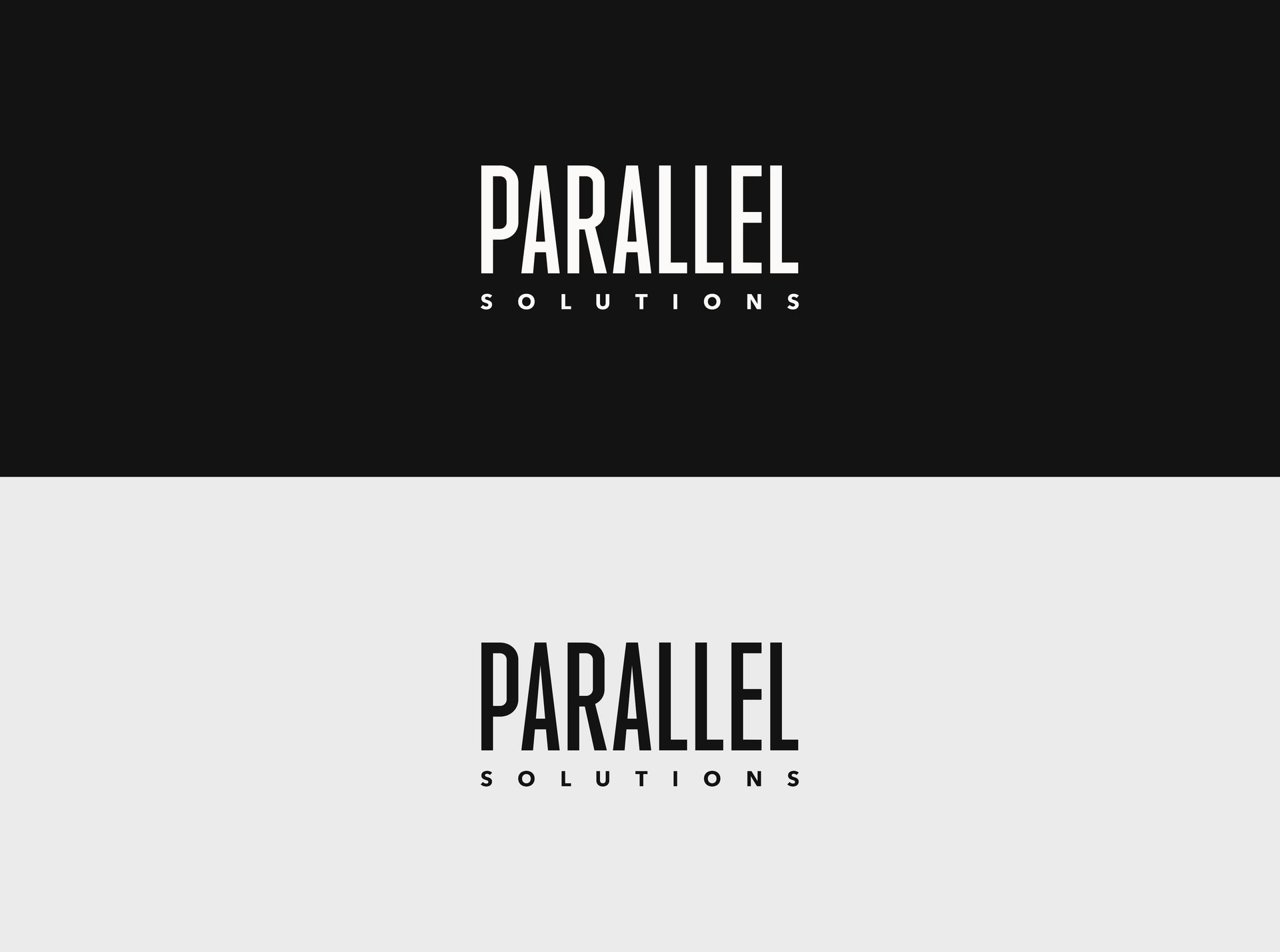
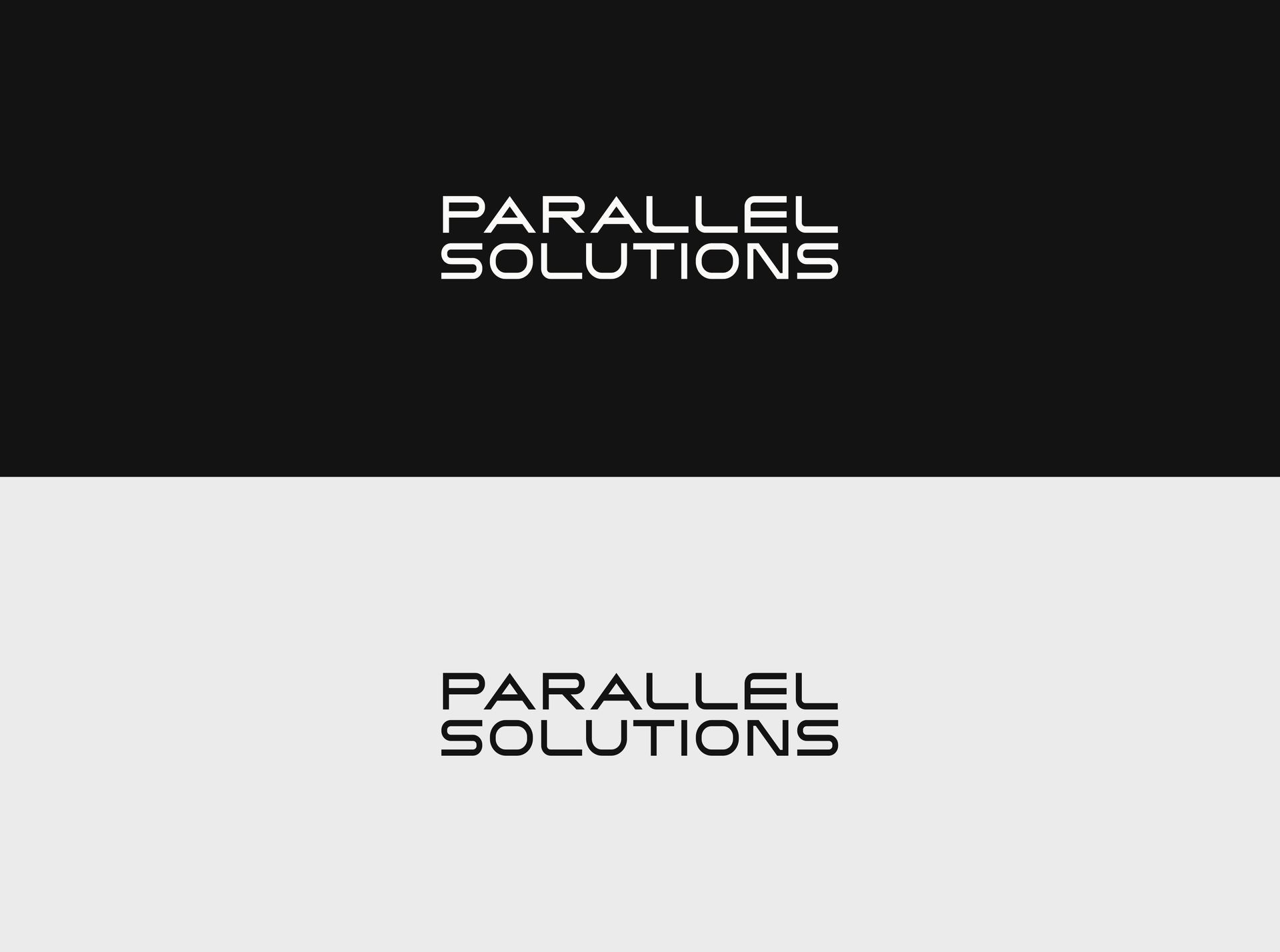
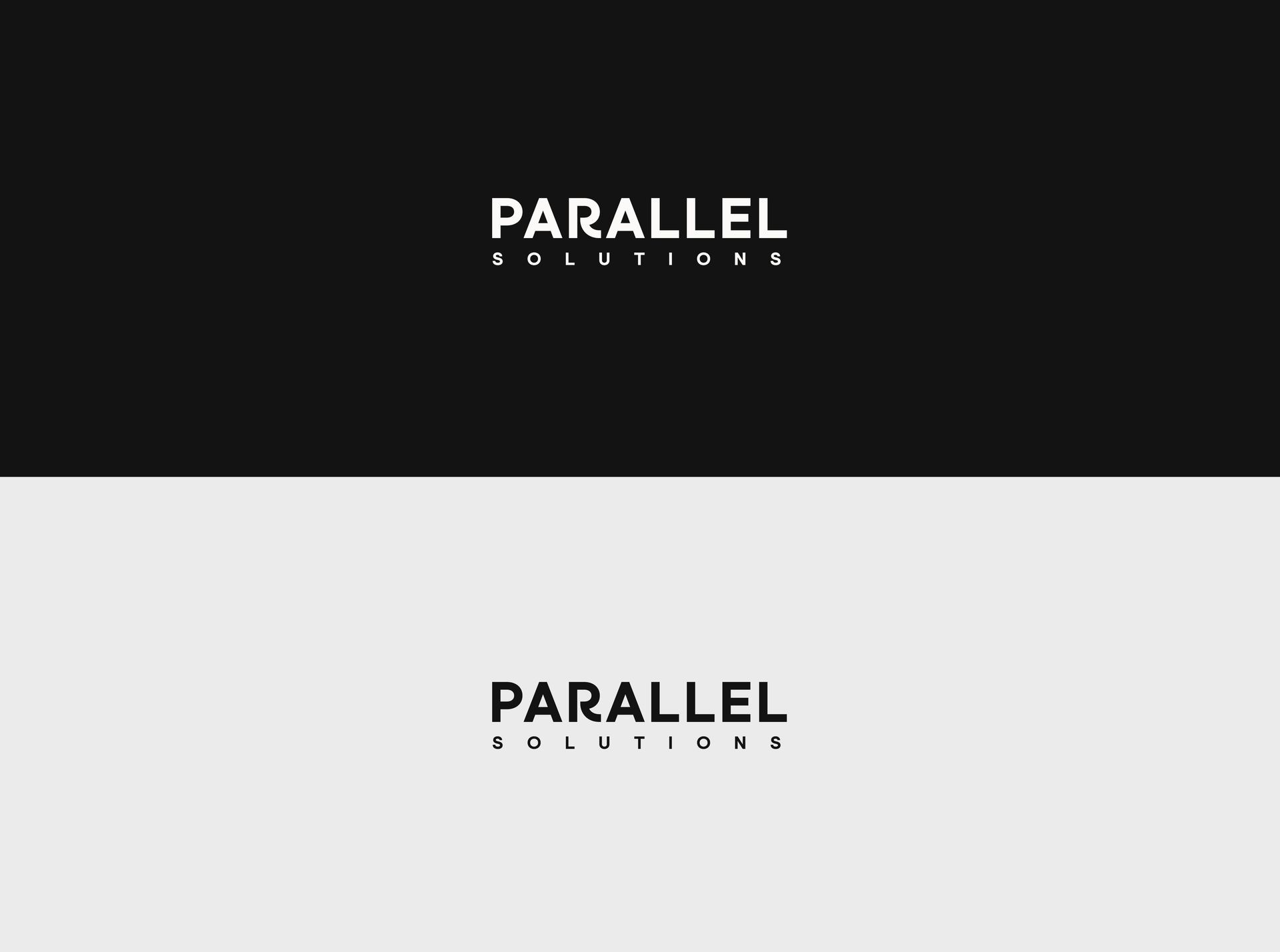
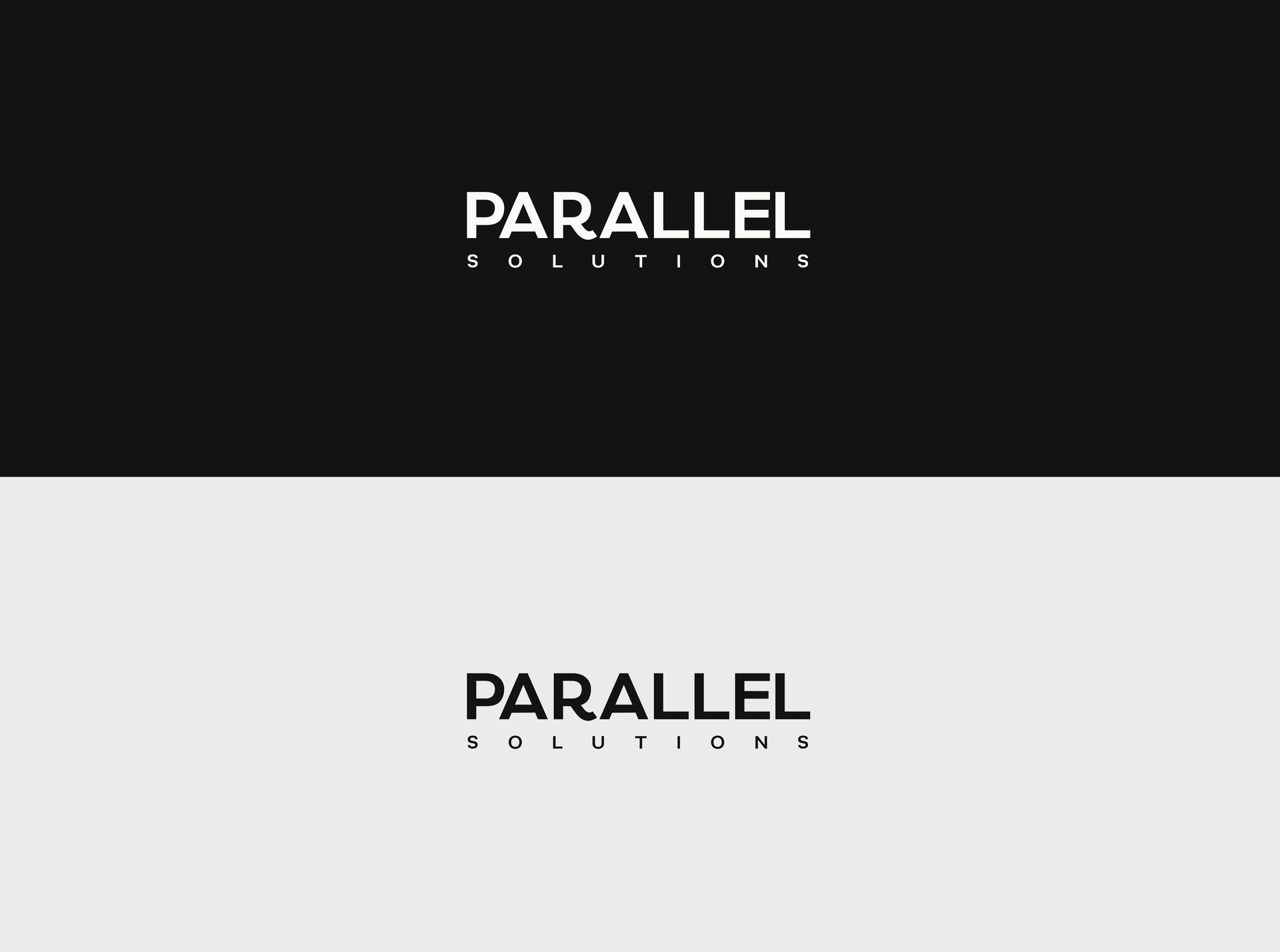
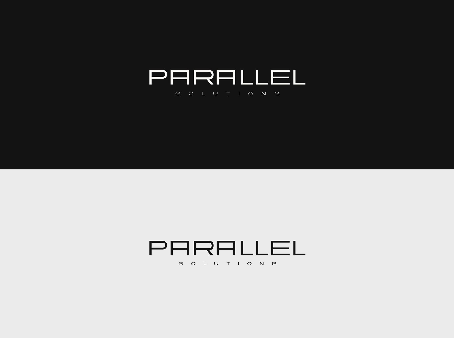
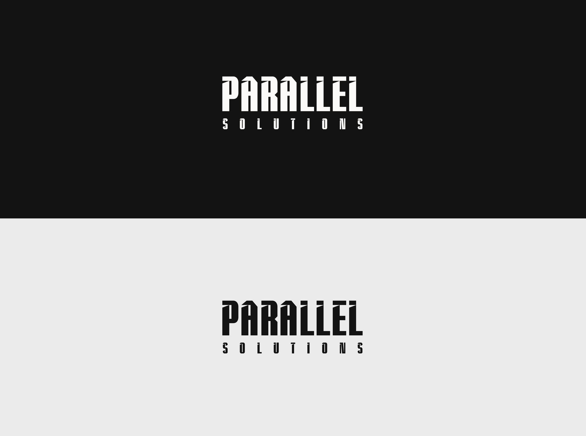
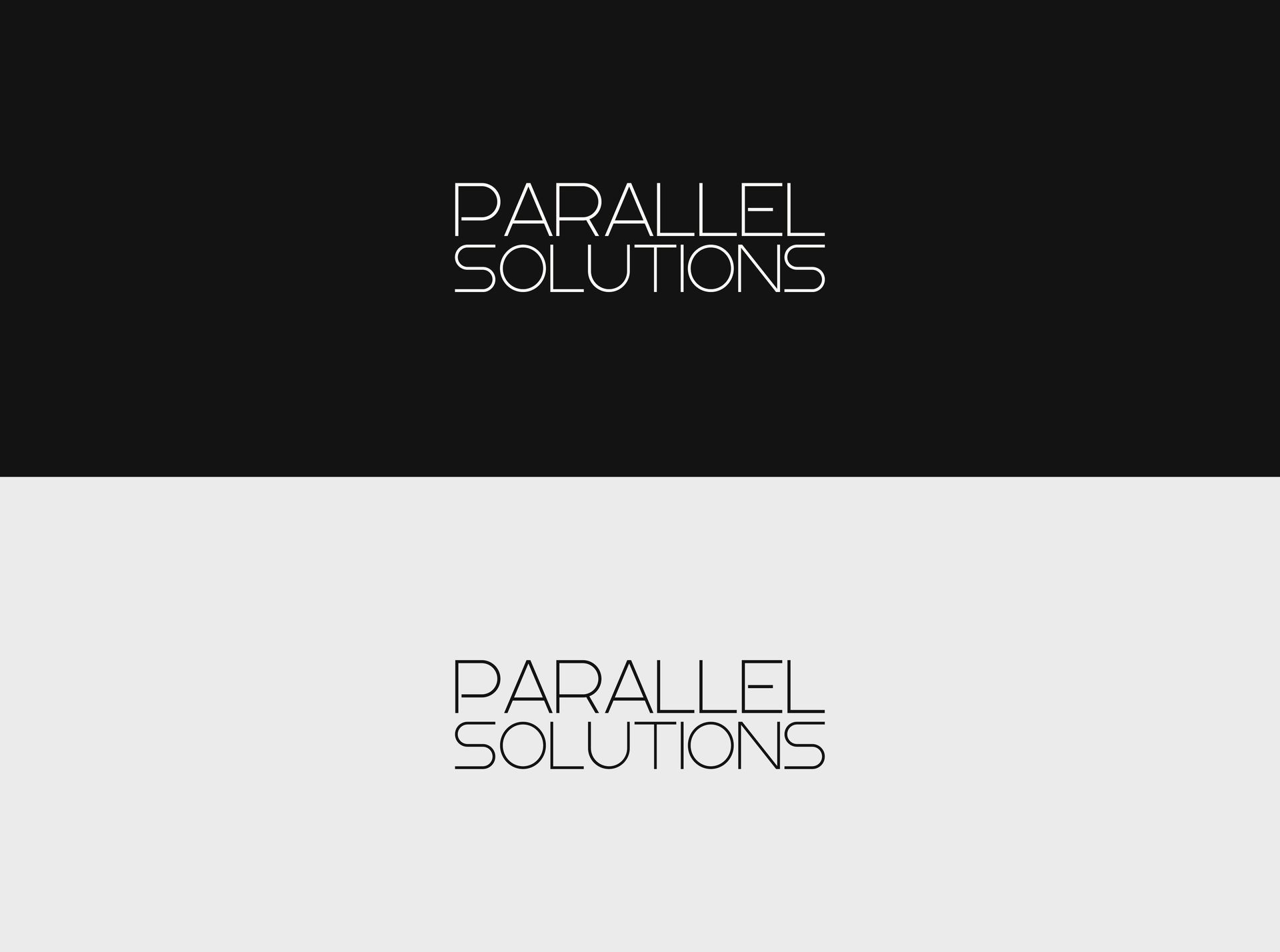
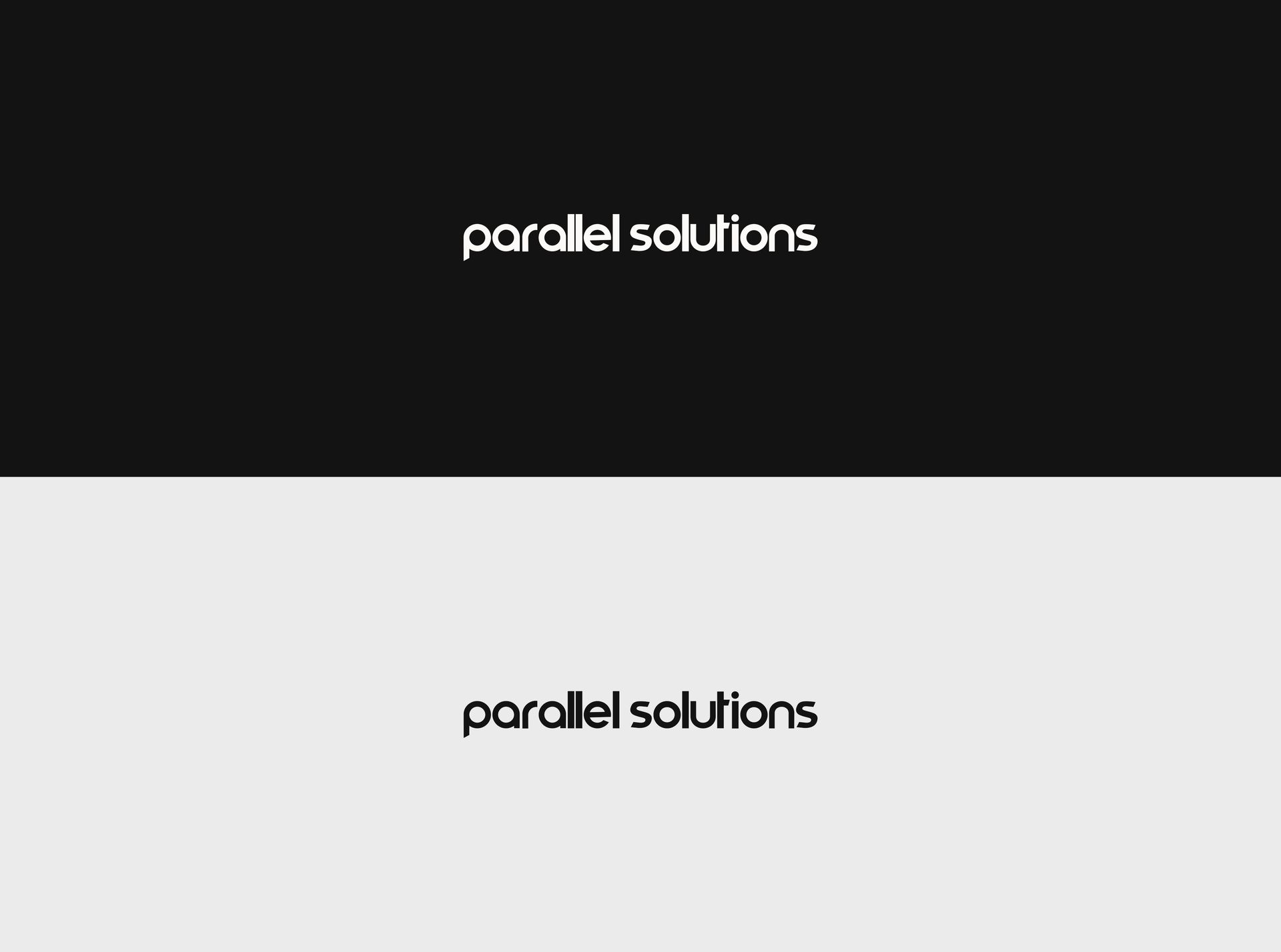
PARALLEL SOLUTIONS
BRAND EXPLORATION - FONTS
Presented to: Sebastian Lowes
Prepared by: Nick Harborne Creative
Parallel Solutions – Logo Font Selection & Next Steps
I’ve explored a variety of font directions for Parallel Solutions, each designed to reflect a strong, modern, and strategic brand identity. The key themes we’ve focused on are:
- Modernity & Innovation – A sleek, forward-thinking aesthetic that feels fresh and future-ready.
- Structure & Precision – A sense of balance and reliability, reinforcing trust and expertise.
- Differentiation & Simplicity – A unique but clean design that stands out while remaining highly legible.
Before moving into the next phase, I’d love your input on which stylistic direction resonates most with the brand. From there, I’ll begin integrating a symbolic feature by working the two "L’s" in "Parallel" into a distinctive design element to strengthen visual identity.
Looking forward to hearing your thoughts!


